Graphic Design is my Passion
designing in public–sharing process behind an in progress branding effort.

I'm tackling the hardest design project of them all—Personal Branding!
Step 1: Type your name
Step 2: scroll through fonts until one works
Step 3: Get some inspiration together and actually think about it, silly!
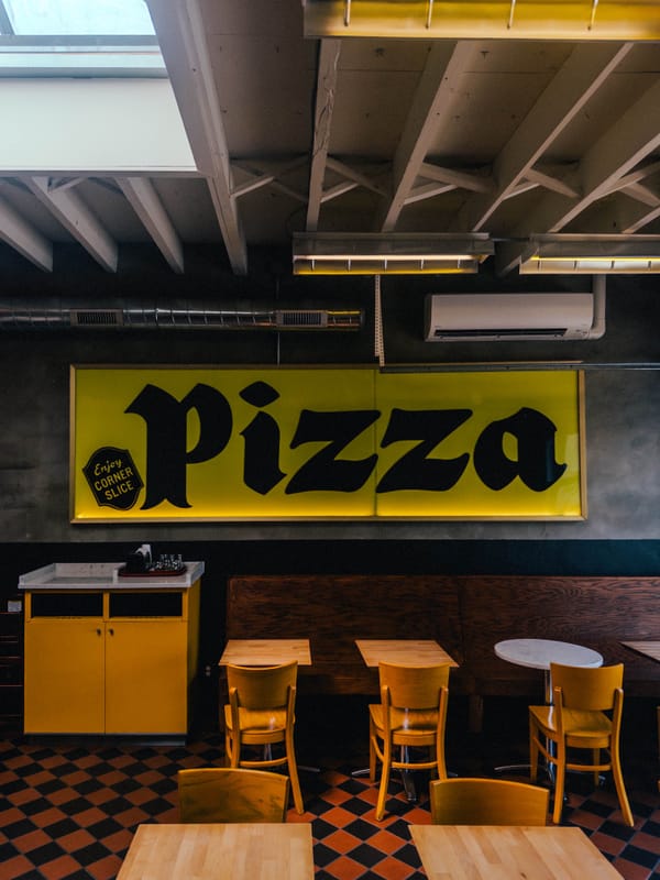
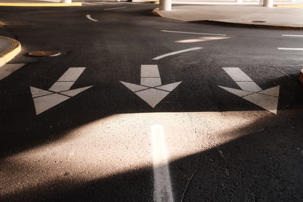
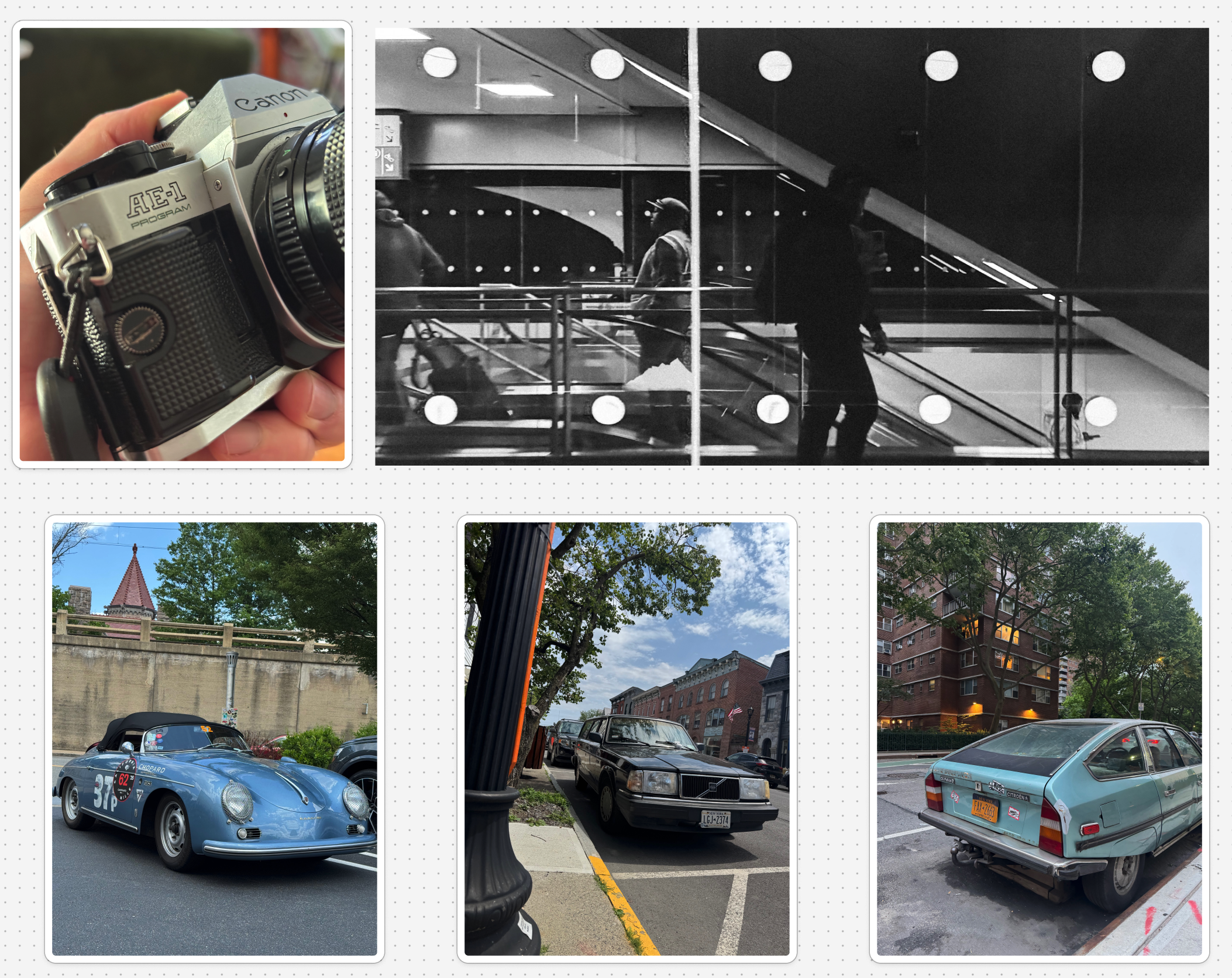
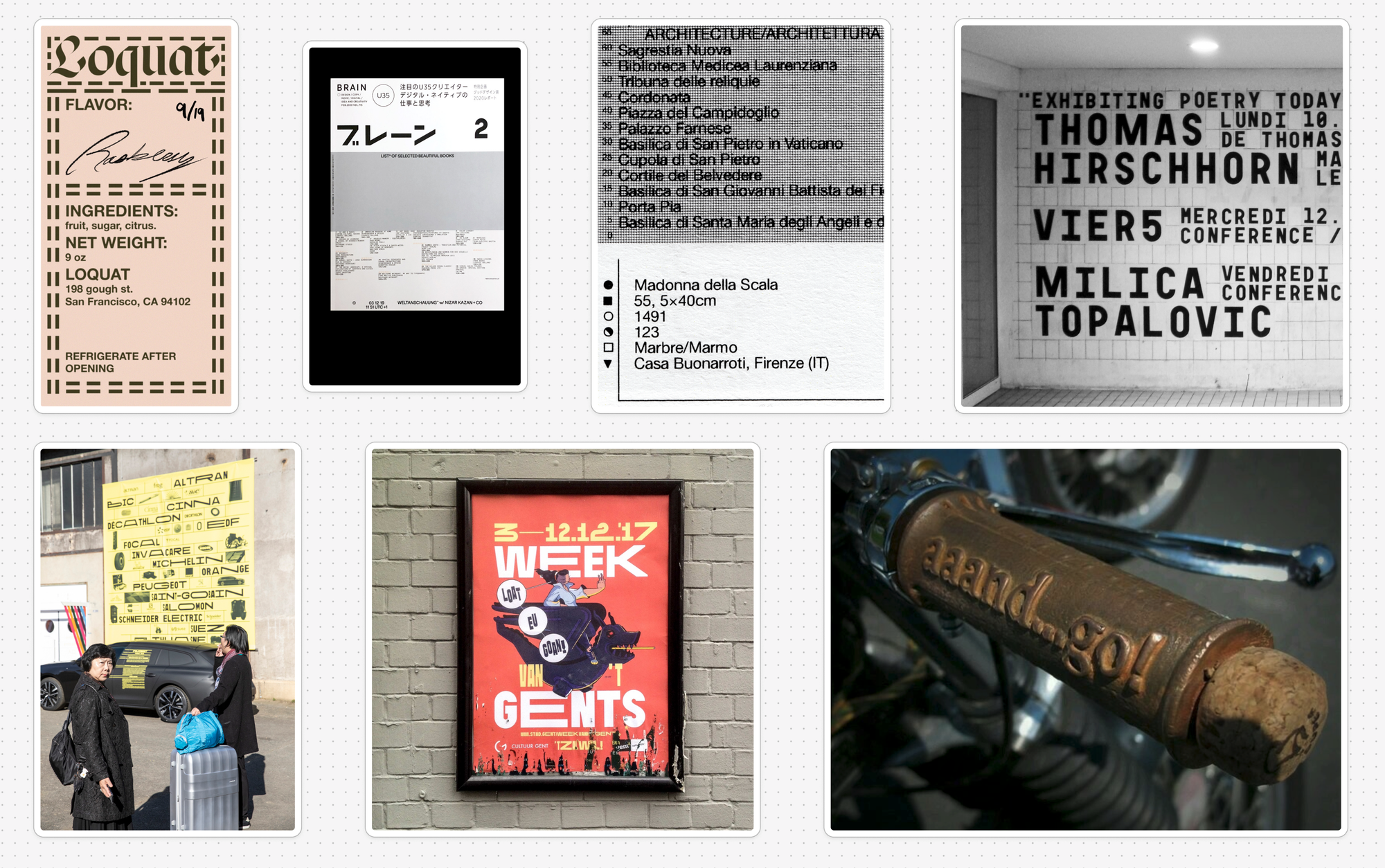
I started a mood board with things that caught my eye and some things I have around the house. If I found them interesting enough to keep, there was probably a something there.
The result was a board full of functional objects with a lived-in feel. It feels very New York to me. love when you come across Ads that have been torn off. theyre so interesting and make the city feel lived in

Wordmark

I found Normal Bold and fell in love with the quirkyness of it. It reminds me of when someone puts up a sign but they're out of letters, so they need to use a different case to finish what they're writing.
Logo
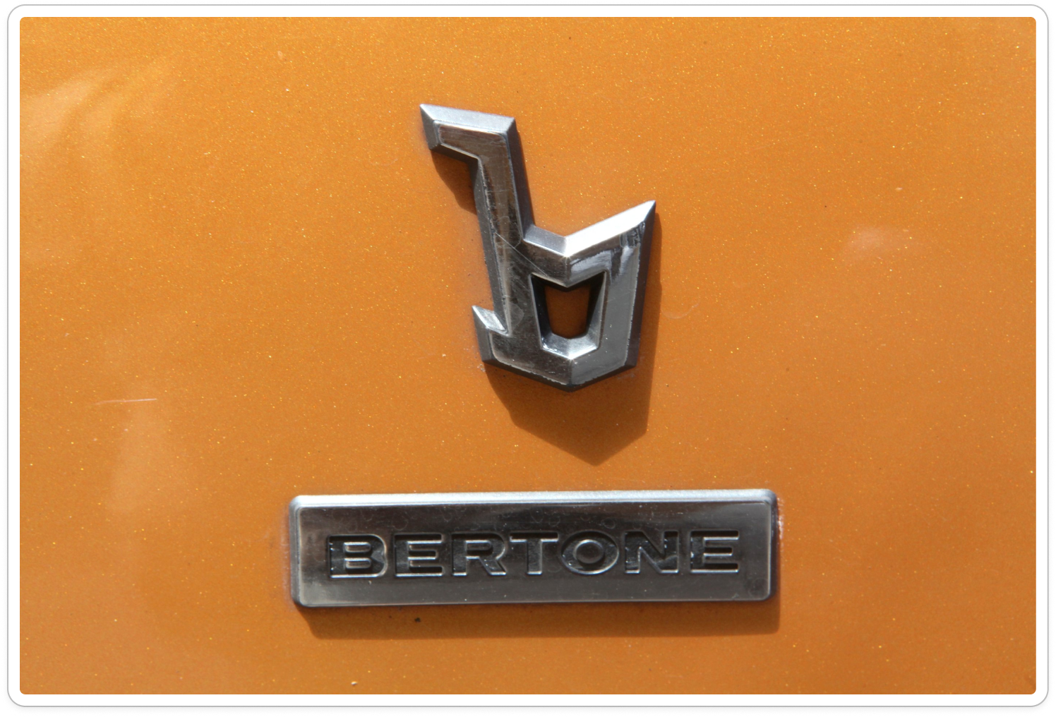
The circular logo is inspired by the Bertone design firm and it's geometric b.
I used Linea72 as the basis for the PC monogram. My first explorations combined the P & C characters with some adjustments to the lines. It looked nice, but I ended up using a rotated P as the basis for a C character that extends outward. The clipped top to that is a mistake, I guess, but it looks cool.
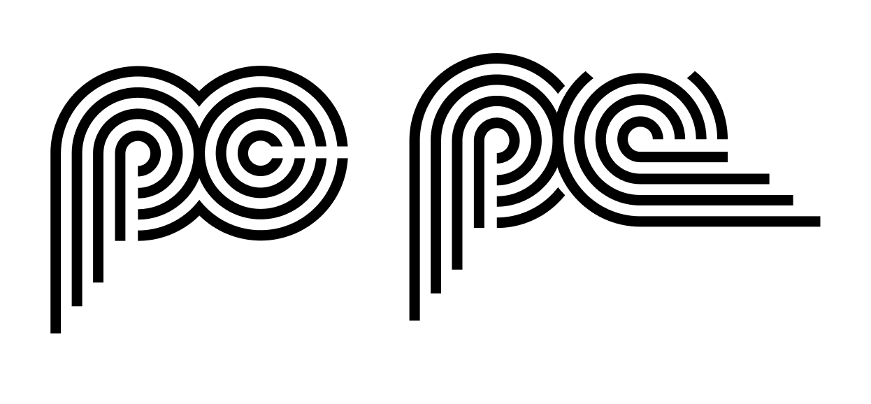
Linea's Regular weight didn't scale down great, so I used the Inline weight instead.
I'll probably write this out in more detail later, but wanted to share some progress.
What I'm Listening To
- Sigur Rós - Route One I've had this on in the mornings recently. I'm very slowly making my way through the road trip and enjoying a nice ambient track while I start my day
- Terraplana - Morro Azul Brazilian Shoegaze. It's very dreamy and I likely won't ever stop talking about this band.
- Nine Inch Nails - Pilgrimage The Fragile has been on heavy rotation recently. It's an intense song and there's something really interesting and unsettling about the synth horns.

